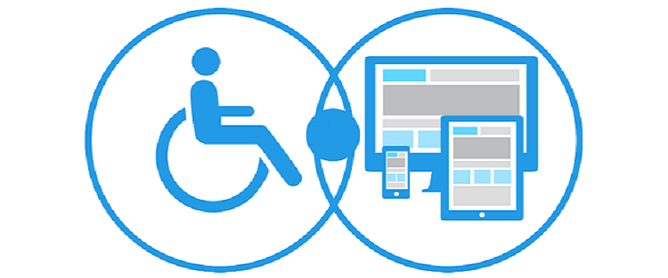
There is a great deal of importance that is now being given to usability and accessibility in design. When we look at these terms, we usually look at them in relation to inclusion in design and it is their goals and approaches to design that tend to overlap quite significantly.
Design is all about imagining, imagining what you perceive and then eventually laying it out in the form of a picture that people will enjoy looking at.
It is important to outline the importance of usability and accessibility in UX design as well as the fine line that divides the boundary between them.
Accessibility V/S Usability
These are terms that are synonymous with each other, as a usable website which is not accessible does not make sense and vice versa. If you would look at the deeper meaning behind these concepts, you will understand that although they are synonymous, they also have distinct meanings. If users are not able to access your website or application, then can you really call it usable?
Accessibility essentially means that you have equipped your users with certain abilities that allow them to effectively use your interface. The sole purpose of making an accessible website or application is to ensure that the barriers to understanding and navigating through your interface are removed, thereby creating a more inclusive interface.
When designers are looking at making their websites accessible, they are looking at 2 main categories of the audience- people who possess degrees of technical abilities and people who possess degrees of physical abilities.
Understanding technical abilities
When you are looking at technical abilities of people, it is not possible to paint everyone with the same brush, this essentially means that you need to understand what device your audience is using, where & how they are accessing your content and how technically savvy they are. There might be some people who are relatively new to the smart-phone era and might not possess the same skills as some of your audience. It is important to factor this population into your overall strategy and anticipate the kind of complaints you could be receiving.
Understanding physical abilities
Sometimes designers have to go beyond just technical abilities and consider a section of their audience who might be physically incapable. For example- users with disabilities including visual, auditory, neurological disabilities and others. When you anticipate a situation such as this, it is important to ask yourself questions like:
- Do they require any assistance or any additive features to use the app more effectively?
- Are there other alternative ways of delivering the same content to them?
Now, when we talk about usability, we aren’t looking at generic, seemingly vague statements that say “usability means where everyone can use it”. This is something that seems like common sense but it’s surprising to know how wrong designers can get it sometimes. You might have a great product but your website design might actually drive your audience crazy and as a result, far away from you.

The best idea of usability would be that customers or your audience are getting by your website or application so easily that they haven’t stopped to wonder how good it actually is. There are a few ways you can look at increasing the usability quotient for your website, making it a friendlier platform.
- Doing a thorough research of your audience in terms of what their existing patterns are is perhaps one of the best ways to start.
- Never think that you are above testing your designs. Testing your designs more than once is the ideal way to ensure you are using. Usability tests and A/B testing go a long way in evaluating your work.
Accessibility and usability are key elements of the design process and designers who get it right, are likely to benefit from a satisfied user base.

 Web and Full Stack
 CMS and Frameworks
 Online Marketing
 Cloud Services
 ECommerce
 Mobile


